Each image can be shown in full size (640x480) if you
click on the small version in this table.
The linked titles lead to amazon.com so that you can look them up for possible purchase if they interest you -- IST does not receive any return from these links. For anything except the newest titles, try www.half.com and see if you can order a used copy at half price or less.
Function -- What are the objectives for the materials and/or experiences that are being designed? These objectives are not the same as instructional objectives, although they are related to instructional objectives. Instructional designers do not always consider the functional requirements that must be met by the actual materials that make up an instructional experience. Design plans may be precise about the objectives of a lesson, but materials are created with functional objectives in mind even if they are not stated. Globally speaking, the primary objective of any material or experience is to support the objectives of the instruction. In order to provide such support, materials and experiences must fulfill specific objectives -- reduce anxiety, facilitate navigation, illustrate causality between two specific events, and so forth.
Form -- this term is used in the design professions to refer to the tangible properties of the thing being produced. Color, texture, shape, smell, style, layout, imagery, music, sound effects -- all are "formal properties" of a design. Be sure to distinguish in your own mind between "formal" (meaning the opposite of informal) and "formal" (meaning the tangible components of a design).
These days we are used to objects that have been created by designers who were taught that "form follows function" so most of the everyday articles that we use are comparatively plain in form. Items that are highly decorated (picture frames, some clothing, "nostalgia" items designed in old-fashioned styles) are generally created to serve an affective, or emotional, function -- to remind their users of days gone by, or to identify themselves with frivolity and fun.
At the same time, computers have made it possible for untrained designers to produce newsletters, web pages, and all kinds of informational/instructional materials. Since forms are the external components of design, novices often copy forms, or add forms in profusion to a design, without thinking about their functional purposes.
Experienced designers frequently think of form and function in the same mental breath, so to speak. They know which is which, but they take shortcuts when they handle these concepts - jumping to examples of form so quickly that you don't realize they are considering the functional purposes of those forms.
Why do we place such emphasis on the difference between
function and form?
Novice designers should be careful to specify functions
and match forms to those functions in order to avoid selecting forms that
are inappropriate, or loading a design with forms that have no functional
purpose. You need to know which one you're talking about at a given time
or you will miss functions that are important and devote much effort to
forms that are unimportant.
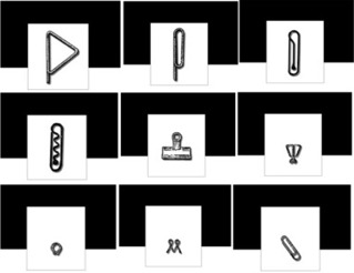
(this image links to the paper clip activity)
Try the paper clip activity to illustrate both Petroski's principles to yourself.
Henry Petroski uses the paper clip to illustrate his assertions that any given function may be made manifest through more than one formal design, and that no formal design may ever be optimized for all the possible functions required of it.
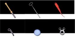
(this image links to the odd thingies activity -- large file!)
Context is a powerful aid to interpreting affordances. A long, thin, sharp instrument communicates in all contexts that it will afford poking, punching through other materials, and perhaps gouging or scoring with some precision. Context changes the actual task calling for these capabilities -- in a sewing context the instrument may be a needle, whereas in a dentist's office an object with similar affordances might be a tool for scraping clean the surfaces of teeth.
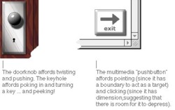
In addition, many affordances that seem to be intuitively understood are, in fact, understandable only because we have learned the association between the affordance and the appropriate use of an object. The humble door knob certainly suggests grasping and perhaps pulling (as one may use a knob-type drawer handle), but using it by turning and pushing or pulling a door is something most of us learn through countless observations and trials when we are too young to remember how we gained the knowledge.
Try the odd thingies activity (large file!) to illustrate to yourself that form is contextual, and that although form displays affordance -- the interpretation of form is not "intuitive."
Ecological theories of perception hold that we derive information from the environment directly without elaborating on it. We explore and interact with the environment, getting feedback from each action directly to reinforce it or alter our next actions. In this view of perception, we recognize "affordances" present in the environment. Affordances are the interactions that are possible with objects and events. The concept of affordances is the basis for some of the principles for effective icon design, in particular the choice of images, choice of viewpoint for an image, and the relationship of the icon to the rest of the screen display.
Mijksenaar, P., & Westendorp, P. (1999). Open here: The art of instructional design. New York, NY: Joost Elffers Books.
Misanchuk, E., Schwier, R., & Boling, E.(2000). Visual design for instructional multimedia. Saskatchewan, CA: U-Learn.

(there is no large version of this image)
CORRECT EXAMPLE: The web site will project a natural, folksey and "homey" feeling.
INCORRECT EXAMPLE: The visitors to this site will get a natural, folksey and "homey" feeling from the site.
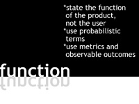
Use probabilistic terms. As much as you would like to, you cannot guarantee (especially ahead of time) that your design will achieve the desired outcomes, or that it will behave as you hope. You set yourself up for failure if you express your functional requirements too definitely.
CORRECT EXAMPLE: The web site will attempt to stimulate visitors' curiousity to the extent that they follow links away to the MP3 site and listen to at least of the sample tracks.
INCORRECT EXAMPLE: The learners will follow links away to the MP3 site and listen to at least of the sample tracks.
Use metrics and observable outcomes. If you cannot see the outcome, you do not know it has happened. If you cannot measure the outcome, at least generally, you do not know when to be satisfied with it.
CORRECT EXAMPLE: The web site will attempt to stimulate visitors' curiousity to the extent that they follow links away to the MP3 site and listen to at least of the sample tracks.
INCORRECT EXAMPLE: The learners' curiousity will be stimulated.

(there is no large version of this image)
CORRECT EXAMPLE: To satisfy the functional requirement that the site will project a natural, folksey and "homey" feeling, I used a warm combination of browns together with green to achieve a color scheme reminiscent of log cabins in the woods. I chose a sans serif typeface in an informal style to reinforce the informal, folksey feeling of the site. Originally I used a photograph taken at a national songwriter contest for the first page, but I replaced it with this one which matches the color scheme better and is alos a more intimate close-up shot that feels more quiet, more "at-home." The warm skin tones and guitar finish in this photograph also add warmth to the first page of the site. I keep the color scheme constant since the site is small, and I included some informal - even goofy - photos in one section to continue the "just plain people" impression that the functional specification calls for. I have kept my writing style informal and personal as well.
INCORRECT EXAMPLE: To satisfy the functional requirement that the site will project a natural, folksey and "homey" feeling I chose tan for my background color. Since it is the color of wood.
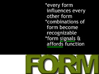
Combinations of form become recognizable. Consider the common combinations to which your learners are exposed. Take advantage of the ones that might help you and avoid the ones that give the wrong flavor to your message.
CORRECT EXAMPLE:This color scheme is associated by many people with the colors used in signage by the US National Park Service (where I worked for years), and I hope this will further enhance the impression of naturalness, outdoors, and folk music feeling.
INCORRECT EXAMPLE: [In the incorrect example, the designer would not recognize that this color scheme invokes others in common use (US National Park Service, natural foods packaging, the lighting effects of cozy scenes in movie westerns and other indoors, firelit scenes). Absence of any mention that this color scheme is reminiscent of others would be incorrect for this project.]
Forms signals and affords function but does not specify function in detail. Use form to encourage the appropriate use and interpretation of your materials, but do not depend entirely on form to arrive at the outcome you desire.
CORRECT EXAMPLE: I ordered the navigation list on the left of the screen to encourage people to feel that I am an accessible musician and to provide information about how to get my CDs, since that information is what I am most frequently asked for at shows. By placing "Contact Us" and "CDB CDs for Sale" at the top of the list, I hope to place the most useful choices where people can find them easily.
INCORRECT EXAMPLE: Since "Contact Us" and "CDB CDs for Sale" appear at the top of the navigation list, people will go to those links first. Then if they want more detail, they will visit the other links to learn more about me and my music.


SUGGESTED REFLECTION ACTIVITY
Look around during your daily activities. Before very long you will be able to find two examples of media design that serve similar functional purposes in general, but do so in different formal ways. Collect a pair of examples, and examine them. Consider the following questions:
What are the formal differences between your examples? Find words to express them, even if you do not think of yourself as being in command of a professional design vocabulary. "Feeling" words are often useful (joyous, doleful, strtling), as are simply descriptive terms (dark, large, detailed, smooth).
If you had made these formal decisions in a design, what might have been your purpose for doing so?
Can you identify interactions between formal elements -- or combinations of elements that create a familiar pattern? What are those interactions and combinations?
What would the specific differences in functional specifications have been to result in these formal differences?
Do you think the functional requirements were the same, but the formal differences are a matter of style only? Why do you think so?
Form and function are two different things. Formal elements should be chosen to support functional objectives.
More than one form may support a particular function. No single form will support a given list of functions in the most optimal way for all of them. A given design needs to be optimized for the most critical functions to be performed -- which means that designers have to create functional specifications AND prioritize them.
Forms do not automatically communicate their functions, but they do communicate
Forms interact with each other. Choosing the "best" single form for each function and gluing them all together will not make an effective product. Combinations of forms tend to create recognizable forms in their own right. Designers need to become familiar with many forms and form combinations in order to make good choices and avoid accidentally creating the wrong combination for a given product.
Heller, S. (1999). Design literacy (continued): Understanding graphic design. New York, NY: Allworth Press.
