Each image can be shown in full size if you click on the small version in this table.
ELABORATION
How do we organize and talk about color?
Contrast in hue
Contrast in brightness
Process for establishing a color scheme
Summary
The linked titles lead to amazon.com so that you can look them up for possible purchase if they interest you -- IST does not receive any return from these links. For anything except the newest titles, try www.half.com and see if you can order a used copy at half price or less.
How do we organize and talk about color?
The debate over how human beings in general, and human beings in various specific cultures, organize color is an open one with many fundamental questions unanswered to the satisfaction of those who study this topic. Although we and some other primates do seem to organize color into a few reliable "basic" categories, the behavior and language of different cultures with regard to color vary widely (Hardin & Maffi, 1997). If you read about the development of different systems for describing color according to the properties of color, the perception of color, the application or semantic understanding of color, the affective appreciation of color and so on, you soon realize that any trepidation you may be feeling over selecting and using colors is well-founded -- the domain is complex and the many systems within it are complicated (Wallschlaeger & Busic-Snyder, 1992, pp. 245-256).
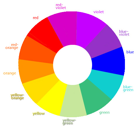
For our purposes the standard Newton-type color wheel used in elementary art classes can be useful because it allows us to talk about color concepts within a somewhat familiar, if very simplified, structure of terms. The color wheel shown here is organized by hue, and the colors on it are shown in roughly uniform brightness.
- The basis of the wheel is comprised of the primary colors, or those used in additive color mixing to create other hues --- red, blue and yellow.
- The secondary colors are those created by roughly equal proportions of the primaries -- we call them violet (purple), green and orange.
- The tertiary colors lie midway between each primary and secondary color -- yellow-green, blue-green, blue-violet, red-violet, red-orange, and yellow-orange.
Perception of color
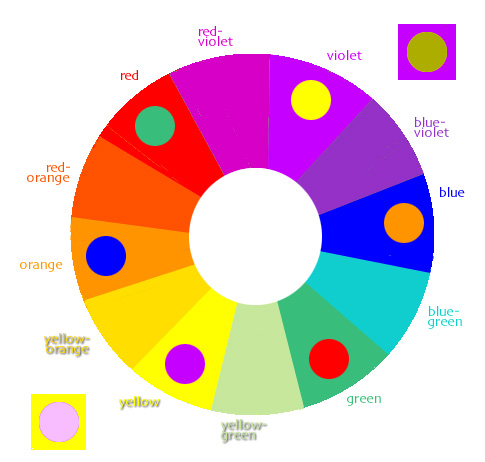
Our eyes do not perceive colors absolutely as do the instruments used to measure colors, because of the way our physical perceptions operate. Our perceptions of colors are strongly influenced by:
- the conditions under which we see colors (red turns to gray faster in low light conditions than do other colors)
- the other colors surrounding a certain color (a red bird appears more brilliant against a background of green leaves than it does against the red side of an old barn)
- the amount of a given color present at a given time (your dining room painted yellow appears to be a much brighter yellow than did the tiny paint sample you brought home from the store
Hardin, C.L. & Maffi, L (Eds.). (1997). Color categories in thought and language. Cambridge, UK: Cambridge University Press.
Wallschlaeger, C. & Busic-Snyder, C. (1992). Basic visual concepts and principles for artists, architects and designers. Dubuque, IA: Wm. C. Brown.
Hue ... hue is what we usually mean when we say, "What color is it?" When a color varies enough in its wavelength that we begin to call it by a different name, then it is a different hue.
Brightness ... used here to refer to the amount of light in a hue and compared tothe relative darkness that results when a hue is mixed with black.
Contrast in hue
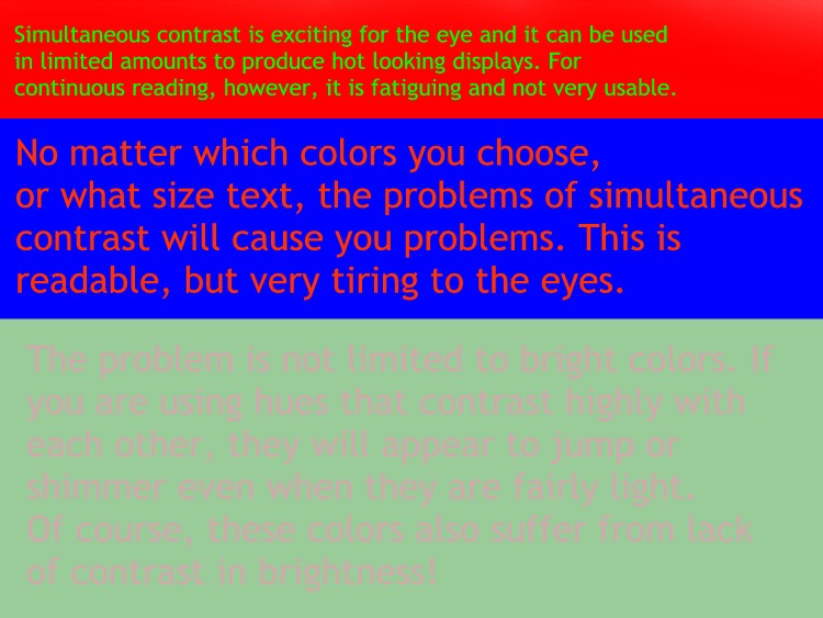
High contrast in hue
Because of the way that our eyes take in color information from the environment,
we perceive certain hues as contrasting more strongly with each other
than they do with other hues. The strongest of these contrasts are termed
"simultaneous contrasts" (see the enlarged view of the illustration).
In these color combinations our eyes literally have trouble focusing on
both areas of color at the same time, so the images appear to jump or
shimmer - when in fact, it is our eyes that are shifting in the attempt
to keep the visual field in view. This type of contrast can be heightened
by showing the contrasting colors in very close value (equal in the amount
of black/gray mxed into them) and by using small amounts of one color
on a field of the other. Although these combinations are visually exciting
(literally exciting the eye!), they can be distracting and very difficult
to look at. You see them fairly often on the web because naive designers
instinctively recognize how energized such combinations can be, but they
are especially problematic for displaying text and unless you are creating
big displays for maximum "bang," you should avoid the strongest
hue contrasts available. [A horrible example
of simultaneous contrast problems.]
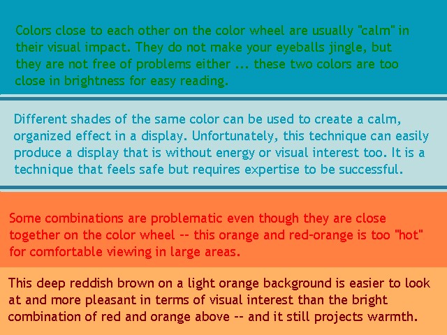
Low contrast in hue
When people learn about the problems with high contrast
in hue, they often turn to the safer alternative -- low contrast in hue.
With this strategy, the designer chooses colors next to each other on
the standard wheel or uses darker and lighter shades of the same color.
These combinations are low in contrast between the hues, and they do avoid
the problem of very high contrast combinations. The main problem with
low contrast in hue is that such combinations are too easily boring and
tend to have an amateurish feeling. It is also difficult to manage the
dark/light contrast effectively in these combinations -- and using color
for grouping or coding information is not easy to manage with low hue
contrast. In spite of the drawbacks, it is possible to base your color
scheme on low contrast combinations as long as you adjust brightness appropriately,
and select a coordinating contrast hue for highlighting parts of the display.
[Example of the problems with low hue contrast.]
Contrast in brightness
Contrast in brightness interacts with contrast in hue. As hues become darker, they contrast less well until finally they are almost indistinguishable. The same is true as hues become lighter. In addition to choosing colors (hues) that work well together, you need to adjust the brightness of the colors you work with so that they contrast sufficiently well for easy visibility. Most successful color treatments for information/instructional displays include more colors that are light, or made slightly gray, than they do bright colors. Bright colors are used to focus attention, enliven the display, and establish dominance for important information. Think of maps -- the big areas of color tend to be very light while the details are bolder and brighter. That way the background of the map does not compete for visual attention with the foreground.
Contrast in brightness is generally more useful than contrast in hue, and contrast in hue generally does not work well without contrast in brightness. In other words, you will need to use both contrast in hue and brightness to create a useful color scheme.
Misanchuk, E., Schwier, R., & Boling, E. (2000). Visual design for instructional multimedia. Saskatchewan, CA: U-Learn.
Process for establishing a color scheme
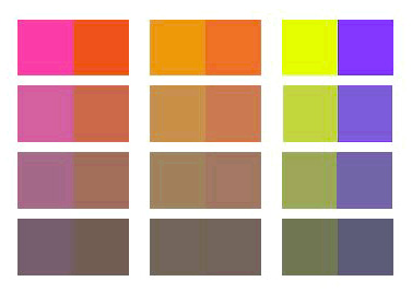
1. Choose an anchor color. The anchor color will set the tone or mood of your entire display. There is no simple away to say what mood is set by which color, since the effect of any color is changed by the other colors appearing with it and by the amount of the color that appears. The effect of colors is also dependent on context -- both of the learners and of the situation in which they consdier themselves to be. While it is true that people in general tend to be excited by red and calmed by blue, these findings are too vague to tell you exactly which color should be your background color. You have to try out your choice with the accent, or focusing colors that you choose. Interior designers and costume designers and others use little samples (chips or swatches) of different colors, laying them next to each other to guage their effect and to experience how they will look before committing themselves to an overall color scheme.
2. Choose one or two contrasting or focusing colors. This is the point at which most beginning designers despair -- "How can I choose contrasting colors when I know nothing whatsoever about color?" Keep the color wheel in mind -- if you want a calm, stable looking product, choose your contrasting colors from nearby your anchor color on the wheel. If you want a more dynamic, exciting look, choose form the contrasting colors further apart. I recommend looking into one of the color systems that are available too -- Kobayashi (1990) offers one of the most extensive and easy to understand. The system is laid out in an affective matrix and then presented as a series of specific color schemes that are characterized by the moods or tones they project -- sophisticated, serious, natural, and so forth. There are several books in this genre, and one of them is probably a good investment for anyone who has had limited experience designing with color.
3. Use your anchor color and variations on the focusing color to fulfill every function possible before adding another color. Resist the temptation to reach for a new hue each time you realize that you need to add an element to your screen design. Displays that contain many contrasts in hue become more and more difficult for viewers to perceive as organized, so you end up with a design that does not appear to have a color scheme at all -- just a lot of color. Most of the time you do not need as many different "signals" (like new colors) in display as you may think that you do --simplifying the elements that are there, arranging them neatly in space, and keeping visual noise to a minimum will help people sort out what you're showing them.
Kobayashi, S. (1990). Color image scale. Tokyo, Japan: Kodansha International. This author has produced several books on the basis of his scheme for organizing color according to its affective propoerties ... very useful for browsing and choosing combinations of colors that convey the general feeling you want in a product.
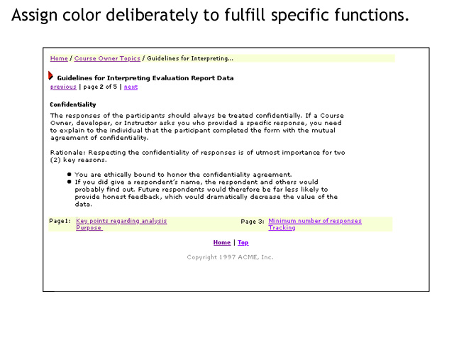
Apply color deliberately to fulfill certain functions.
It is easy to see the functional use of color on a simple web page design ... if the designer of the page has adhered to the standard expectation of early web guidelines, blue text designates an unfollowed link and purple text designates an followed link. In this example, yellow has been used to designate the areas of the screen containing navigation and orientation information. At the top is a hierarchical chain showing where this document is situated in the overall publication and at the bottom is a local navigation bar giving access to the immediately preceeding and following pages in this document.
Although color can play a viable functional role in establishing the mood for a display, be sure you are giving your attention to the functional roles of key colors (probably your accent colors) being used for specific informational purposes like navigation, labeling, highlighting, and so on. These functions should be very clear in your mind and should be as few as you can manage.
Brown, J.P. (1997). Document design prototype. Unpublished.
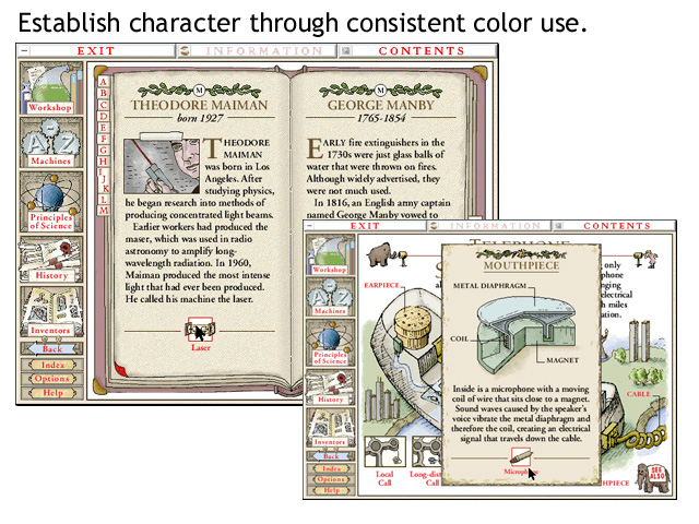
Establish character through consistent color use.
Once you have designated certain colors to fulfill certain functions, use those colors consistently. People who are focusing their attention on interesting content, or who are trying to learn something they need in spite of motivational problems, will not appreciate color changes intended to "interest and motivvate" them if those color changes result seemingly arbitrary changes to the document they are navigating. Irritation and confusing are very demotivating, and result in loss of attention rather than increased attention to your content. The "motivating" effect of color is less powerful than the demotivating effect of irritation and confusion.
In the example shown here, browns, yellows and greens provide the background affective color scheme. It is a calm, quiet color scheme that allows the flexibility of natural color in illustrations while retaining a consistent feeling throughout the product. Against this basic color scheme, the designers have chosen to use red as the single accent color. All the text you see in red is clickable and anything not clickable is not red.
McCauley, D. (1998). .How Things Work, CD ROM version. DK Publishing.
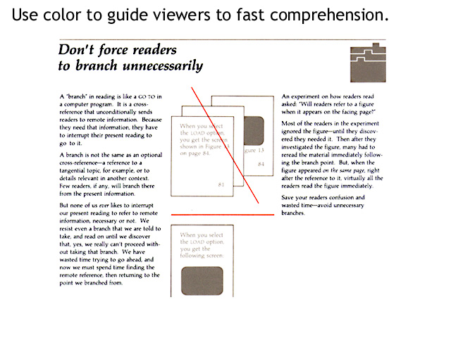
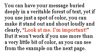
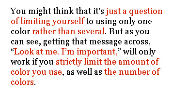
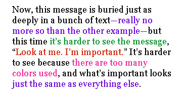
Use color to guide viewers to fast comprehension.
When most of your color scheme is "quiet," or not filled with many colors competing for attention, you can use color most effectively to call attention to the specific items or areas where learners need to focus.
Take particular care not to overdo this technique:
Hargis, G. (Ed.). (1998). Developing quality technical information: A handbook for writers and editors. Upper Saddle River, NJ: Prentice Hall. The page sample is actually from a precursor in-house publication: IBM Handbook for Quality Technical Documentation, which is not, as far as I know, available for purchase.
Misanchuk, E., Schwier, R., & Boling, E. (2000). Visual design for instructional multimedia. Saskatchewan, CA: U-Learn.
SUMMARY
You can spend a long, long time becoming an expert in
the use of color. If you don't have a long, long time to spend, the
best advice most people will give you is to use color sparingly and carefully.
Be sure you know why you are using the colors you choose, and be consistent
in how you use them. Ask people for the feeling they get from color combinations
you have created. Look around your environment and notice the clor combinations
being used in advertising to indicate certain moods or impressions --
bright and bold for fast food, subdued and pale for elegant housewares,
shocking and exagerated for teenagers' clothing. These combinations change
quickly, so you need to keep your eyes open all the time. You may or may
not adopt a color scheme to convey a certain mood similar to the one you
have seen advertisers use, but you definitely want to guard against conveying
the wrong mood acidentally because you were not paying attention
to the meaning of a color scheme in people's daily lives.
The basic plan for using color when you don't have years of experience (and even when you do!):
- start with a base color
- add accent colors judiciously
- know what role each color is playing in your diplays
- use colors consistently